
Overview
Sleep quality significantly impacts overall well-being, yet many individuals struggle to understand their sleep patterns. This project focuses on designing a user-centered, data-driven sleep tracking dashboard that provides actionable insights into sleep stages while maintaining a visually engaging and intuitive interface.
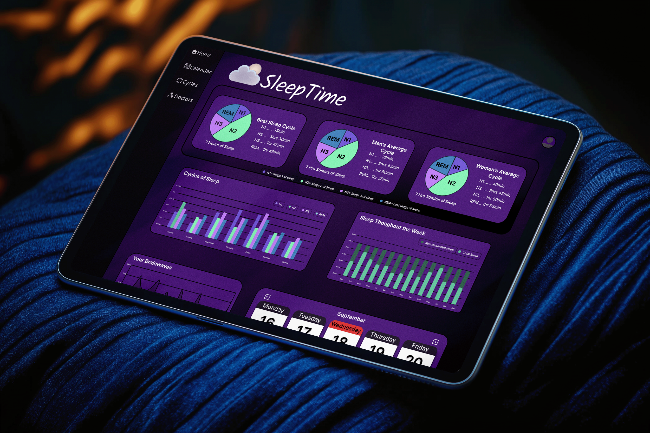
The SleepTime Dashboard enables users to analyze their sleep trends, recognize potential issues, and receive tailored recommendations. By integrating a streamlined information architecture, intuitive data visualization, and human-centered design principles, the dashboard empowers users to make informed decisions about their sleep health.
Problem Statement
Many individuals experience poor sleep quality but lack the tools to track and interpret their sleep data accurately. Existing sleep-tracking applications often present complex or overwhelming data visualizations that fail to provide clear, meaningful takeaways.
Key Challenges:
Users need a simple yet comprehensive way to visualize their sleep cycles.
Sleep data must be presented in a way that is both informative and engaging to encourage regular use.
The dashboard should be accessible to a broad demographic, ensuring usability across different age groups and levels of tech literacy.
The Design Thinking Process
Research & Discovery
Understanding user needs
Interviews
Competitive analysis

Ideation & Wireframing
Brainstorming concepts
Low-fidelity layouts
User flow

Branding & Visual Design
UI kit
Cohesive identity
Typography

Prototyping & Testing
Usability testing
High-fidelity prototype
Refining
Research & Discovery
The project began with qualitative research to understand users' sleep habits, pain points, and expectations for a sleep-tracking tool. To gain insight, I conducted user interviews with individuals experiencing sleep difficulties, including my parents, to identify common concerns.
Sample Research Questions:
Do you feel like you get enough quality sleep each night? Why or why not?
Have you used a sleep-tracking device or app before? What did you like or dislike?
What features would be most helpful in improving your sleep?
Would a sleep dashboard with historical data, cycle analysis, and recommendations be useful?
From these interviews, a key insight emerged: many users find existing sleep data overwhelming or difficult to interpret. They expressed a need for simplified visual representations and actionable recommendations.
Ideation & Wireframing
After analyzing user insights, I brainstormed potential layouts and key functionalities for the dashboard.
Key Design Considerations:
Minimal cognitive load: The interface needed to be visually clean and intuitive to prevent information overload.
Modular information architecture: Data should be structured in a way that allows users to explore high-level overviews or deep-dive into details.
Color psychology: Since sleep is associated with relaxation, I researched calming color palettes and selected shades of purple to create a serene and restful user experience.
I translated these ideas into low-fidelity wireframes in Figma, iterating based on peer feedback and usability considerations.

Branding & Visual Design
To create an appropriate emotional response, I developed a visual design system that would:
Use a calming color palette (primarily purples) that evokes tranquility
Implement data visualization principles that simplify complex information
Ensure accessibility for all users regardless of age or technical proficiency
Balance information density with white space for easy comprehension
Prototyping & Interaction Design
With a solid wireframe structure, I developed an interactive prototype in Figma and conducted usability testing with design peers.
Key Enhancements Based on Testing Feedback:
Simplified Navigation: Users preferred a four-category system for easy access:
Home: High-level sleep summary and trends.
Calendar: Historical sleep data visualization.
Cycles: Breakdown of sleep stages with interactive graphs.
Doctors: Access to sleep health professionals.
Enhanced Data Visualization: I incorporated engaging yet digestible graphs and an information wheel to display sleep cycle breakdowns effectively.
Scalability & Accessibility: The design ensures mobile adaptability and potential app integration for future development.
Reflection & Next Steps
This project taught me valuable lessons about:
Designing interfaces that balance data complexity with user accessibility
Creating visualizations that communicate meaning rather than just numbers
The importance of extensive user research when designing health-related tools
Future Development
If developed further, I would:
Implement integration with popular sleep tracking devices
Add machine learning capabilities to provide more personalized insights
Conduct longitudinal studies to measure actual improvements in sleep quality
Expand user research beyond my immediate circle to gather more diverse perspectives
Retrospective
This project demonstrated the power of thoughtful data visualization to transform complex health information into meaningful, actionable insights for users. By focusing on both the technical aspects of data representation and the emotional experience of the interface, the dashboard creates a compassionate tool for improving an essential aspect of human well-being.