Overview
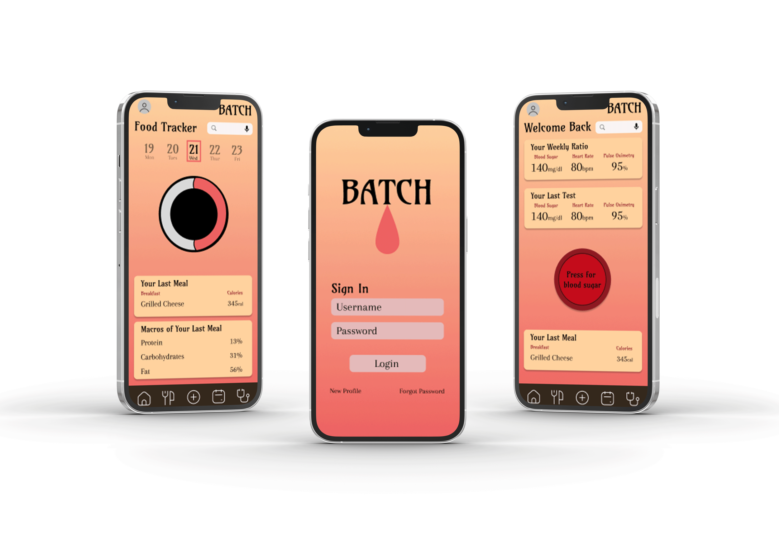
Batch is a comprehensive diabetes management app designed to help users track and monitor their blood sugar while supporting other critical aspects of their daily care. Inspired by my grandfather, who dislikes the discomfort and inconvenience of finger-prick tests, Batch was built with empathy, simplicity, and user safety at its core.
Unlike many glucose monitoring apps, Batch offers an all-in-one health management experience:
Blood Sugar Tracker for easy, clean logging and historical insights
Food Tracker to monitor meals and see trends
Emergency Police Line for instant contact in case of a medical emergency
Calendar View to help users correlate readings with meals, activities, and other life events
Doctor Database for storing and accessing healthcare professionals
Appointment Scheduler to manage visits and reminders
Batch was created not only to reduce the physical burden of diabetes management, but to support users emotionally and logistically through thoughtful features and design.
Problem Statement
Most diabetes management apps are either too clinical, overly complicated, or lack the full set of tools people need. Many users, especially older adults, struggle with apps that prioritize charts over usability or fail to integrate daily tasks like scheduling, emergencies, or meal tracking.
People living with diabetes deserve a tool that respects their time, simplifies their routines, and protects their health, without making them feel like patients 24/7.
The Design Thinking Process
Research & Discovery
Understanding user needs
Interviews
Competitive analysis
Ideation & Wireframing
Brainstorming concepts
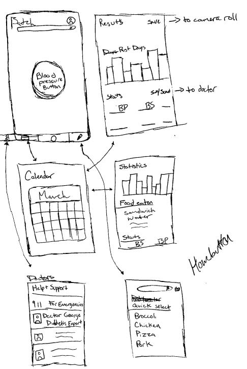
Low-fidelity layouts
User flow
Branding & Visual Design
UI kit
Cohesive identity
Typography
Prototyping & Testing
Usability testing
High-fidelity prototype
Refining
Research & Discovery
To understand user needs deeply, I conducted:
Interviews with people living with diabetes (including my grandfather), parents of diabetic children, doctors, and nurses
Surveys about daily management habits, app frustrations, and pain points
Persona development based on diverse user types: elderly users, caretakers, newly diagnosed young adults, and tech-savvy independents
Competitive Analysis
I examined three major apps in the diabetes space:
MySugr – Offers gamified tracking but can feel cluttered and overwhelming
Gluroo – Designed for families, but lacks flexibility for solo users
OneTouch Reveal – Strong in data presentation, but impersonal and overly clinical
Key Gaps Identified:
Cluttered interfaces
Poor emotional design
Lack of centralized health tools in one place
Inaccessibility for older users or non-tech-savvy individuals
Ideation & Wireframing
I began with low-fidelity wireframes, shared with test users to observe how they navigated the app and which features they valued most.
User Feedback Highlights:
"I don’t want to dig through menus just to log something."
"Make the info clean. I want to understand my numbers right away."
"Love the idea of an emergency button."
From there, I developed mid- and high-fidelity prototypes in Figma and refined:
Button size and color contrast for accessibility
Dashboard layout to prioritize clarity
Navigation flow to support older users and quick use under stress
Branding & Visual Design
Batch’s aesthetic is calm and functional. Design choices included:
Soft, high-contrast colors for visual clarity and emotional warmth
Simple typography for older adults and readability under stress
Modular layout so that key actions (log, alert, view, schedule) are never more than two taps away
Prototyping & Interaction Design
Starting with low-fidelity wireframes, we experimented with different layouts for features like group listening rooms, artist fan hubs, and public feeds for sharing music-related content.
We quickly moved to mid-fidelity prototypes in Figma, refining interactive patterns like posting reactions to songs, starting a group listening session, or commenting live during an artist’s podcast stream.
Through user testing, we validated several important ideas:
Users loved the ability to instantly jump from a song they were listening to into a related fan discussion group.
Having access to merch and ticket links directly from artist profiles was a major win for music fans who usually have to hunt these things down separately.
Group listening needed better controls for shared playback and chat integration, which led us to propose customizable listening rooms for future development.
Reflection & Next Steps
Designing Batch was a deeply personal experience. My grandfather’s discomfort with traditional diabetes tracking shaped many of the app’s core ideas, especially ease, speed, and emotional comfort. Batch reimagines what a diabetes management app can be, not just a clinical dashboard, but a supportive partner. By combining thoughtful features, inclusive design, and personal motivation, Batch empowers users to manage their health with confidence, comfort, and clarity.
What I learned:
Simplicity is powerful. Even the most critical medical tools benefit from user-centered, human-first design.
Emotional design isn’t a luxury—it’s a necessity when dealing with health.
Great tools don’t just inform; they support.
Next Steps:
Explore integration with wearable CGMs (Continuous Glucose Monitors)
Add a mood and energy tracker to connect emotional health with physical readings
Expand emergency services with user-defined contacts or live assistance

